Want to Learn Responsive Web Design Basics?
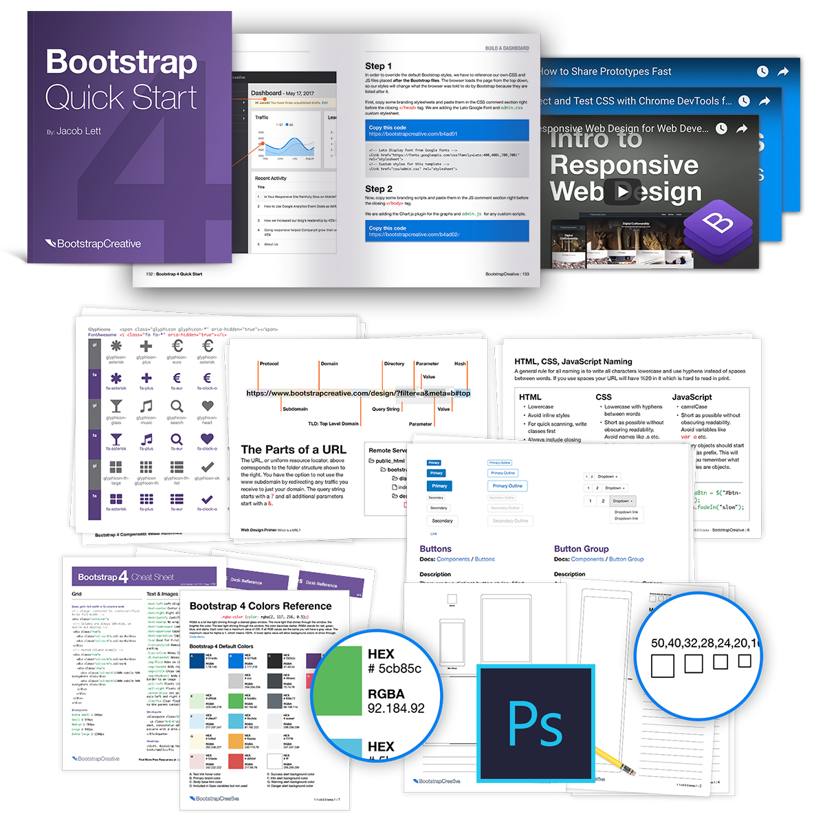
Bootstrap 4 Quick Start Book
Download Free Digital Version | .zip Buy Paperback Book on Amazon
Are you a Web Development Beginner?
The Bootstrap 4 Quick Start Book and resources are for beginner web developers and web designers who are looking for a quick way to go beyond basic HTML & CSS and learn responsive web design and development.
Who is this for?
- You have never built a website before.
- You know some HTML & CSS but are new to responsive web design basics.
- You are a backend developer or programmer and want to improve frontend skills.
In one weekend you will have a solid starting point to begin building your mobile first projects with Bootstrap 4.